
.png)
Top 9 Wedding Color Pairings for 2026
- PlanYourParty

- Feb 5
- 8 min read

Choosing your wedding color palette is one of the first — and most consequential — decisions you'll make in the planning process, other than the playlist. These colors will live in every floral arrangement, every photo, every tablecloth, and every anniversary post for the next thirty years. Before you even pick a venue or a caterer, most couples already have a color feeling in mind. The problem is getting from "feeling" to an actual color palette that works across your florals, linens, attire, and lighting.
What's standing out in 2026 weddings is a clear shift away from safe and expected. Couples are reaching for contrast, intentional layering, and combinations that feel personally theirs rather than just pretty. Earth tones are getting bolder, pastels are getting more deliberate, and jewel tones are showing up in unexpected pairings. Below are the nine color combinations doing it best — plus real guidance on how to execute each one.
How to Choose a Wedding Color Palette (Before You Fall in Love With One)
Before diving into specific palettes, it helps to think through a few questions that will narrow your options fast:
What's your venue's existing palette? Exposed wood beams, stone walls, white-on-white ballrooms, and garden greenery all carry their own tones. A palette that looks stunning in a white modern venue can completely disappear in a rustic barn — or fight against it. Let the architecture inform you, not the other way around.
What season is your wedding? Not because certain colors are "for" certain seasons, but because natural light changes everything. Saturated, high-contrast colors like cobalt and yellow shine in bright summer daylight. Richer, moodier tones like mulberry and plum photograph beautifully in the lower light of fall and winter.
How many colors can you actually manage? Most strong 2026 palettes use one anchor color, one or two complements, and a single neutral to rest the eye. Four or more active colors across your florals, linens, and attire can become chaotic fast. Simpler is usually stronger.
Test before you commit. Swatches in a store look different from fabric in a venue under candlelight. Always test your palette in the actual light conditions of your event before finalizing it.
The 9 Best Wedding Color Palettes for 2026
1. Blue and Red-Orange

There's a reason designers lean on high-contrast color theory — it works. Pairing a rich, saturated blue with red-orange creates a palette that signals confidence and reads as genuinely modern. This is a bold choice with real visual impact, particularly in outdoor settings where the colors can breathe against natural backdrops.
How to execute it: Use blue as your anchor in linens and bridesmaids' attire, then bring in red-orange through florals and candles. Warm terracotta vessels and wooden elements help bridge the two colors without making the palette feel jarring.
Best for: Couples who want their wedding to feel editorial and striking rather than soft and traditional. Fall outdoor ceremonies or modern indoor venues.
Florist tip: Protea, garden roses in coral and persimmon shades, and deep blue delphinium carry this palette exceptionally well.
2. Cobalt Blue and Yellow

Cobalt is having a real moment in wedding design, and when paired with yellow it becomes something genuinely energetic. The depth of cobalt grounds what could otherwise be an overwhelming bright, and yellow brings warmth and optimism without making the palette feel childish. Together they're confident, vivid, and fun without trying too hard.
How to execute it: This palette rewards restraint. Use cobalt as the dominant color in bridesmaid dresses or table linens, and bring in yellow as an accent through florals, napkins, and candles. White or ivory as a neutral keeps it from tipping into too much.
Best for: Spring or summer weddings. Modern venues, outdoor gardens, and couples who are genuinely unbothered by being memorable.
Florist tip: Sunflowers, blue hydrangea, and yellow ranunculus with greenery give this palette a natural feel that keeps it from looking too graphic.
3. Sunset Tones — Red, Orange, and Blush

This trio captures something a single color simply can't: a mood. The warmth of red and orange carries real emotional weight, and blush softens the edge just enough to keep it from feeling intense. For outdoor settings especially, these colors look stunning from ceremony through golden hour into the reception. Think layered textures, bright florals, and lots of natural light.
How to execute it: Anchor with a deep terracotta or red in your florals, let orange and coral carry through in bridesmaid attire or table runners, and use blush in the softer details — napkins, candles, ribbon, smaller blooms.
Best for: Outdoor ceremonies, romantic venues, couples who want warmth and emotion woven into every detail.
Florist tip: Ranunculus, garden roses, and dahlias in coral, peach, and deep red do most of the heavy lifting here. Mix with dried pampas or bleached grasses for texture.
4. Mulberry Grove — Deep Purples and Berry Tones

Mulberry grove isn't really a single color — it's a layered palette built from rich plums, berry tones, dusty mauves, and deep violet. Used together, these create something that feels sophisticated and fashion-forward without straying from classic elegance. This is the palette for couples who want their wedding to feel like a candlelit evening in, not a garden party.
How to execute it: Layer across a range of values — deep plum in florals, dusty mauve in linens, berry tones in bridesmaid dresses. Warm metallics like antique gold or burnished brass complement this palette far better than silver.
Best for: Fall and winter weddings. Indoor venues with warm lighting where the depth of this palette can really register.
Florist tip: Sweet peas, dahlias, hellebores, and fig branches in berry and plum tones are the signature flowers of this palette.
5. Orange and White

Crisp white paired with vivid orange is one of those combinations that manages to feel both classic and unexpected. The white provides breathing room, and the orange does exactly what it's supposed to do: pop. This pairing travels well — destination weddings and outdoor venues where sunlight amplifies color are especially ideal.
How to execute it: Let white dominate in ceremony backdrop, tablecloths, and attire. Orange should show up with intention: a bold floral arrangement, a signature citrus-toned bridesmaid palette, or statement vessels rather than a fully saturated tablespace.
Best for: Destination weddings, outdoor summer venues, and couples who want classic bones with a bold accent.
Florist tip: Marigolds, ranunculus, and garden roses in tangerine and peach keep this palette refined. Avoid anything that drifts toward a Halloween orange — warm, saturated citrus is the note you want.
6. Baby Blue and Chocolate Brown
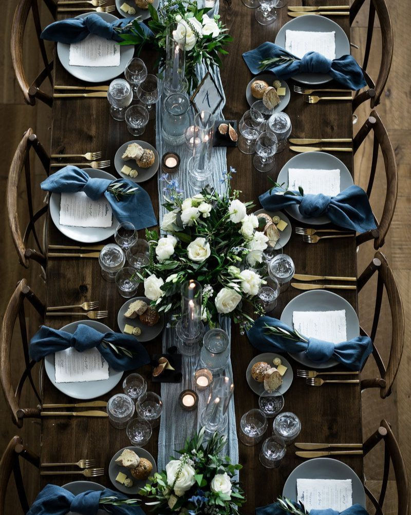
This combination surprises people. Baby blue and chocolate brown shouldn't work as well as they do — but that's what makes it worth knowing. The softness of baby blue and the richness of chocolate create a balance that feels mature and considered rather than cute. It's grounding in a way that more saturated palettes aren't, and it's genuinely versatile across seasons and venues.
How to execute it: Use chocolate brown in wood elements, vessels, and accent details. Bring baby blue in through florals, ribbons, and bridesmaid attire. Cream or ivory as a neutral ties the two together without effort.
Best for: Any season. Works especially well in venues with natural wood or warm-toned architecture.
Florist tip: Blue delphinium, dusty miller, white garden roses, and brown-toned dried botanicals make this palette feel gathered and intentional.
7. Chocolate Brown and Cream

Where the previous pairing brings contrast, this one leans into warmth and cohesion. Chocolate brown and cream together feel like a candlelit room — rich, inviting, and genuinely timeless. It works beautifully in venues with exposed wood or stone, and it photographs warmly across every lighting condition. If the mulberry or cobalt palettes feel too bold for you, this is the sophisticated alternative that photographs just as beautifully.
How to execute it: Lean heavily into texture here. Velvet linens, linen napkins, candlelight, and wooden charger plates are the elements that make this palette exceptional rather than plain. Florals should be lush and tonal — ivory garden roses, dried grasses, brown-edged dahlias.
Best for: Indoor receptions, fall and winter weddings, and couples who want timeless over trendy.
Florist tip: Café au lait dahlias, ivory peonies, brown cotton pods, and eucalyptus give this palette real dimension.
8. Pastel Blue and Butter Yellow

Pastels have gotten a reputation for feeling dated, but this combination sidesteps that almost entirely. The key is how you use them. Pastel blue and butter yellow styled with intentional texture — linen, rattan, natural florals, soft candlelight — read as refined and considered rather than washed out. This palette rewards good styling and natural light more than almost any other on this list.
How to execute it: Avoid flat or heavily synthetic materials in this palette — they'll make it look cheap. Linen tablecloths, hand-dipped candles, textured ceramics, and loose, garden-style florals are the difference between this palette feeling expensive or not.
Best for: Daytime ceremonies, spring and early summer weddings, outdoor venues with abundant natural light.
Florist tip: Forget-me-nots, blue scabiosa, yellow ranunculus, and soft greenery give this palette its garden quality.
9. Chartreuse and Purple

This is the palette for couples who have done the research and decided they want none of it to apply to them. Chartreuse — that sharp, green-leaning yellow — is a genuinely unexpected choice, and it creates real visual tension against regal purples in the best possible way. The contrast is vivid without being chaotic, and it photographs with a freshness that more conventional palettes simply don't have.
How to execute it: Keep chartreuse as the accent, not the anchor. Purple — whether deep violet, lavender, or amethyst — should lead, with chartreuse appearing in smaller doses: a signature bloom, a ribbon detail, greenery with a yellow-green tint. Too much chartreuse tips from editorial into costume.
Best for: Couples who want something truly original. Modern indoor venues, botanical garden settings, editorial-leaning photographers who will know what to do with this palette.
Florist tip: Green anthurium, purple lisianthus, deep violet sweet peas, and green trick dianthus are your building blocks here.
The Common Thread
The through-line in 2026 wedding color trends isn't any specific hue — it's intention. The couples pulling off the most memorable looks are treating color as a design decision, not just a preference. That means thinking about how your palette layers across florals, linens, attire, lighting, and even stationery rather than picking two colors and hoping everything ties together.
Whatever direction you're leaning, start there and build out. Choose your anchor first, find your complement, and pick a neutral that lets both breathe. Then test everything in your actual venue, in actual light, before you commit.
Frequently Asked Questions
What are the most popular wedding colors for 2026? The strongest trends for 2026 lean toward intentional contrast and earth-driven warmth. Deep blues, berry tones, chocolate brown, and sunset-inspired combinations are resonating most. That said, champagne, blush, and sage remain perennially popular because they photograph well in every lighting condition.
What wedding color palettes photograph best? Palettes with at least some contrast tend to photograph better than fully tonal or monochromatic combinations, which can flatten out depending on the lighting. High-contrast pairings like cobalt and yellow, or sunset tones, look particularly striking outdoors. For indoor receptions with warm lighting, richer, deeper palettes like mulberry or chocolate brown translate beautifully.
How many colors should a wedding palette have? Most strong palettes use two to three active colors plus one neutral. More than four active colors across your florals, linens, and attire can become visually noisy and difficult to coordinate. Limiting your palette actually gives it more impact.
Can I use bold colors for a winter wedding? Absolutely. Deep, saturated tones like mulberry, cobalt, plum, and chocolate brown actually shine in winter lighting. They feel warmer and more appropriate for the season than the pastels or bright tones that work better in summer's natural light.
When should I finalize my wedding color palette? Ideally before booking your florist, ordering bridesmaid attire, or selecting stationery — all of which need to align. Most couples finalize their palette within the first few months of planning, once the venue and season are locked in.
The most popular wedding color pairings of 2026 are bold, expressive, and intentional. Decor that tells a story at every turn and is multifaceted with textures, materials, and colors. Planning you're own event, or helping plan someone else's and need inspiration? Check out all our other posts!


Comments